
In 1978, with the welfare state, forged in the post-war détente between labor and capital, embattled and stagnant, and with the neoliberal backlash of Thatcherism looming in the near horizon, Poly Styrene of the band X-Ray Spex asked:
When you look in the mirror
Do you see yourself
Do you see yourself
On the t.v. screen
Do you see yourself in the magazine
When you see yourself
Does it make you scream?1
Capital, from its origins in the printing press through its imperial and industrial accelerations to its “dematerialized” present, compels the mediatic production of identity. Today, in a post-industrial, post-broadcast media environment that redundantly calls itself “social,” we are continuously “inspired,” enticed,2 and coerced to construct and consolidate ourselves as identities across the multiple corporate platforms of contemporary capital. We use texts and images — graphic design — in these projects of corporate subjectivation. And capital compels other identities beyond and below our own: identities of things, i.e. commodities. Graphic design itself exists in order to produce and regulate these kinds of identities. In what follows, we will look at a set of historical identity problems at the intersection of capitalism and graphic design. Problems of identity have articulated the practice of graphic design throughout its history, which is coterminous (if not precisely synonymous) with the history of capitalism. And while the articulation of visual identity — as a system of forms that governs both commodities and people — has been the defining function of the profession of graphic design, identity itself, in all its modern social and political modalities, might be understood as the contingent outcome of those language and media commodities that have historically oriented graphic design practice.
As Karl Gerstner writes, in Designing Programmes, “to describe the problem is part of the solution”3 — which is also to say that the problem in question is a linguistic one. Identity is a word with a complicated genealogy. It has crucial semiotic relations with other words: opposites like difference and alterity, but also neighbors like equivalence, standardization, unity, and abstraction. The word has been applied differently to different things in different discourses. It has lately acquired an urgency in the present, as the name for a political agency of difference aimed at the ongoing racist, postcolonial, gendered, and heteronormative bases of modern capitalist domination. But, to take up a “vulgar” Marxist position,4 we might say that, above all, identity is an economic concept — the stamping of goods as commodities with uniform values — the very concept that underpins the basic process of capitalism: the exchange of equivalents. To cut to the chase, as Frederic Jameson writes: “Exchange value constitutes the primordial form in which identity emerges in human history.”5 In the episodic sketches of design history that follow, we will trace this primordial capitalist form, as it conditions and produces other, imaginary “designed” forms: nationalism, language, and the corporation.
Print Nationalism
Nationalism is capitalist modernity’s basic subjective identity form. Nationalist identity — that imaginary concept of a nation to which a “people” belong — has been famously argued6 to have been the complicated and contingent outcome of the printing press, emerging forms of capitalism, and the seemingly insurmountable diversity of human languages. Typographers and printers, the most legible antecedents to the twentieth-century figure of the graphic designer, might be said to be the principal (if unknowing) agents in the construction of this proto-modern identity form that has proved both catastrophically destructive to world populations and stubbornly persistent in the political imagination.
As the technical development of the printing press coincided with the emergence of new forms of commercial exchange, printed books exploded across Europe. By the end of the fifteenth century, 200 million books had been printed in Europe.7 This dramatic multiplication of commodities was predicated, paradoxically, on a reduction in the number of vernacular languages in which they appeared, materialized in print. Formerly, the language of manuscript books (incanubula) in Europe was univocally Latin, but these books served only a small fraction of the literate markets that the printing press had suddenly made possible. Printer-capitalists were thus driven by the basic logic of capital to seek profits among the non-Latin-reading multitudes.8
What Benedict Anderson has termed “print capitalism” set the stage for national identity, almost accidentally, in two related ways. First, in order to open markets to non-Latin reading populations, language itself was fixed into vernacular forms that could be rapidly reproduced and transmitted over time and space by the printing press. Language — largely ruling class administrative languages grown up in the various centers of European political power — became frozen, in print and speech, for all of its speaking and reading subjects, seemingly for all time. It is remarkable that the particular languages standardized by print in the sixteenth century largely remain the same ones we speak and write in today in Europe and the Americas. And we should note that there was nothing “natural” about the hegemony of these print vernaculars: national languages did not begin organically as “mother tongues.” As Eric Hobsbawm points out, they were “semi-artificial languages, virtually invented” and thus were “the opposite of what nationalist mythology supposes them to be, namely the primordial foundations of national culture and the matrices of the national mind.”9 Furthermore, the standardization of language in print, as European capital subjugated large parts of the globe in colonial projects beginning in the fifteen century, was achieved through the violent suppression of indigenous languages abroad. The linguistic standardization that took place in the wake of this catastrophic expansion of markets had many dimensions: grammar, vocabulary, spelling, but also the form of the book itself — the material medium of the print commodity. Its structure of multiple pages symmetrically bound into a block has remained virtually unchanged, a recalcitrant form, stubbornly identical with itself since the sixteenth century. This formal fixity of the book commodity, despite periodic mutations — like “exaggerated formats, grandiose like disproportionately wide cars, or excessively intense, loud colors like those on posters, or whatever”10 — should be remarkable to contemporary graphic designers who imagine their experimental form-giving powers to exceed the monotonous repetition of political economic constraint. But that’s another story.11
Secondly, having fixed these vernacular languages, print capitalism created “unified fields of exchange and communication” for all the people who read them, discrete fields that excluded all non-readers. These fields of national language — fields of communication and “discourse” but especially of markets — became the shared space of the fabled “fellow readers” of European modernity, the bourgeois modern subject who imagines himself as the public whom all modern media lucidly addresses, and for whose sake it is constituted. Much ink has been spilled on this Enlightenment origin story, but usually with little sense of the violence of its capitalist foundations and ongoing administration. The book commodity, that marvelous object, freezing language into exchangeable commodities, thus hypnotized its readers into a sense of belonging, an identity that would be built as both a narrative and a representation of an imaginary national public that nowhere exists in reality, as capitalism meanwhile wreaked its damage on populations at home and abroad, in plantation slavery and the wage-slavery of factory work.
The production of subjective identity serves capital in other ways too. The capitalist class achieves its hegemony by controlling not only the labor process but also the cultural identity of the working class it dominates. In addition to the policing of wages and laws, it also achieves its domination through the construction of ideologies that can be adopted by the dominated themselves. In an economic and cultural dialectic noted by Etienne Balibar,12 people’s struggles to undo the damage wrought by capitalism can sometimes aim for a “lost unity,” an historically prior identity founded in imaginary national and racist narratives, which is then recuperated by capital to sustain its own domination, by turning working classes against themselves.
But this imaginary identity13 is curiously marked by a fundamental limit: however powerful capitalism has been in violently “organizing” all the diverse forms of life it encounters, it cannot, despite its unshakeable drive towards increasing abstraction, reduce language to a single “universal” form.14 This insurmountable diversity of language, or “fatality” as Anderson terms it, is worth noting as a fundamental contradiction of print capital: capital freezes plural and antagonistic (linguistic, national) identities in order to co-ordinate them into a world system that sustains the local hegemonies of national bourgeoisies.15 As Frantz Fanon writes: “the business of obscuring language is a mask behind which stands out the much greater business of plunder.”16 But in potent contrast to the violently irresolvable linguistic diversity of the capitalist world system, there exists another idea. We might briefly mention it, the communist international one, crystalized here by Langston Hughes:
Lenin walks around the world.
Black, brown, and white receive him.
Language is no barrier.
The strangest tongues believe him.17
Modern Typography and Exchange Value
Capitalist industrial production has shaped not only the forms but also the formalism of its commodities. The linguistic standardization that print capitalism introduced was belatedly sublimated in the formalism of twentieth-century typographic modernism. Typography, technically defined by Emil Ruder as the “mechanical manufacture of typefaces and composition to exact dimensions in a rectangular pattern,”18 has an elemental unit: the letterform. In the square format of the tri-lingual pedagogical compendium Typographie, published in 1967 in Basel, Ruder evocatively described, in three neat columns of German, English, and French, the singular aesthetic of this letterform that printing produces, in fundamental contrast to handwriting:
The printed letter, which can be cast as often as necessary from the mould, goes on being repeated in a precise and invariable form. It is impersonal, neutral and objective by nature, and it is precisely these qualities which enable the typographer to use it universally and to vary his composition in a multitude of ways … Masterpieces of printing, of whatever age, are eloquent of the power and untrammelled individuality of the technique. There is a cool and fascinating beauty about them: they are free from alien borrowings [artfremden Anleihen, emprunt étranger] and from the sense of inferiority which arose through making false comparisons in the early days of printing.19
The essential typographic feature of printed matter is that each letterform in every printed instance always appears the same. This is the fundamental identity that printing uniquely produces: the identity of a letter with itself. In a revealing metaphor, Ruder writes that typography is beautiful insofar as it is free of anleihen, or “bonds.” While we might read anleihen as a general word for obligation, it has the distinctive financial sense of debt. Typographic form thus mirrors the very self-image of the bourgeois subject: something that is uniquely not indebted to anything outside itself. But its autonomy is formed, in a curious aesthetic complication, by its emancipation from the contingency of the human hand. Early printing, Ruder writes, was still formally shackled by its association with the individualistic forms of the manuscript: ligatures, mimicking the continuous fluidity of handwriting, were devised between letterforms; page margins were “illuminated” by hand at the edges of dark blocks of uniformly printed text. Modern typography is finally “free” to formally signify the austere beauty of mechanical repetition and sameness. “Any attempt to attain the spontaneity of handwriting” in typography, Ruder cautions, “is doomed to failure.”20 As part of this program of modernist emancipation, anything extraneous or decorative, like a border, must be eliminated. As Adorno and Horkheimer write in the Dialectic of Enlightenment, in a passage among many passages that offers a stunningly accurate description of the ideology of modernist typography: “the multiplicity of forms is reduced to position and arrangement, history to fact, things to matter.”21 And for the modern typographer, grids dictate the arrangement of forms. As Ruder grimly advises22 the student: “uncompromising acceptance of the sizes dictated by a grid results in a correct and consistent overall design.”23
For its mid-twentieth-century typographic ideologues, the repetition implicit in industrial standardization produced a “magical, almost hypnotic” effect (speaking of print’s hypnotic effects.) For Paul Rand, writing in 1947, repetition is not simply a formal feature of typography but also simultaneously a principle of order in the galaxy of consumer commodities that Fordist capitalism had unleashed (“the feeling of order evoked by rows of methodically placed packages on the grocer’s shelf”), and, in what might appear to be an alarming political extension of form, given the explicit avowal of “politics” by corporate modernists like Rand, of the military aesthetic of the cold war machine itself: “the exciting spectacle of marching soldiers in the same dress, same step, and same attitude.”24
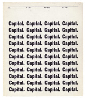
There are other identities that characterize modern typography — especially the hallowed one of form and content; e.g. “form should arise clearly and unequivocally out of the requirements of the text only, and according to the functions of the printed matter”25 — but let’s look more closely at the basic one of standardization and sameness, and recall its ineluctable economic figuration. The identity at the heart of capitalism as a system of production and circulation is exchange value: the logic by which one commodity, in variable quantities, can be made equivalent or identical with another. In the beginning of the first volume of Capital — not the financial journal designed by Karl Gerstner between 1962 and 1963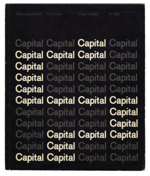
 26 but the book of political economy by Karl Marx first published in 1867 in German by Verlag von Otto Meissner
  27— the nature of the commodity is described as the composition of two things: use value and exchange value. How is it, Marx asks, that despite the multiple and incomparable uses to which we put all the objects with which we reproduce our life, their individual values can be made equivalent in the market, so that, for instance, x amount of corn equals y amount of iron? According to what is called the labor theory of value, exchange value — the thing that grants the exchangeability of commodities — requires a fundamental abstraction: the homogenization of labor. Labor, made abstract, becomes the “social substance” identical in all commodities and through which they become exchangeable as values. Commodities, as they appear in the market, thus signify a social “content,” that of abstract labor. Marx writes:
Turn and examine a single commodity, by itself, as we will, yet in so far as it remains an object of value, it seems impossible to grasp it. If, however, we bear in mind that the value of commodities has a purely social reality, and that they acquire this reality only in so far as they are expressions or embodiments of one identical social substance, viz., human labour, it follows as a matter of course, that value can only manifest itself in the social relation of commodity to commodity.28
In a remarkable twist of form and content, turning the inside out, exchangeable commodities thus “mark a phantasmatic displacement of the sociality of human labor onto its products.”29 We might then read the formalism of modern typography as a sublimation (or, in the peculiar self-reflexivity that linguistic commodities present, the literalization) of the identity that structures the heart of capitalism: exchange value predicated on the abstraction of labor. This identity at the economic level, as Frederic Jameson writes, produces corresponding conformities in thought itself, in the very concepts we use to understand the world. Identity is thus best understood as “not an option but a doom; reason and its categories are at one with civilization or capitalism, and can scarcely be transformed until the latter is transformed.”30 Which is to say, the iron cage of identity appears unbreakable — it covertly organizes even this31 critical account in which the form of modern typography is revealed to be a superstructural “equivalent” to, projected or reflected from, its capitalist base. Until, that is, as Jameson notes, the latter is transformed!
Corporate Identity Program
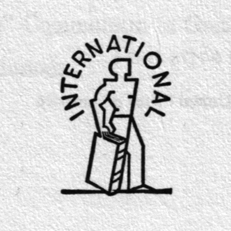
In the postwar period, identity appeared as a fully-formed visual problem for the modern transnational corporation, a problem which graphic design could uniquely solve. “Graphic design” self-consciously comes into being exactly with this problem. No longer simply concerned with the production of difference through trademarks and branding, though still formally anchored to the articulation of property, corporate identity was expansively generalized as a program or a system that could organize all the visual forms produced by the modern corporation. As Adorno and Horkheimer write: “Its ideal is the system from which all and everything follows.”32 There is, incidentally, a sort of arid poetry of the generic in some of the naming of these commercial projects of corporate abstraction: “Total Design” (Wim Crouwel), “Unimark” (Massimo Vignelli), as proper names of design consultancies, not to mention their client corporations (“International Business Machines”) constitute further attempts, by the identity program of design, to collapse the signification of arbitrary difference, in this case the very difference between the signifier and the signified.
Identity in this paradigmatic design project was constituted for the corporation from a set of “universally” valid principles that could be flexibly adapted to multiple commercial contexts. The essential feature was that the identity regulated everything inside the corporate domain, that nothing within it escaped its rationalizing jurisdiction. The identity program organized every material instance in its field: not only graphic design, but architecture and product design as well. And it equally organized all aspects of the visual field, not only typography: “it applies without any restriction to the realm of the visual. Without restriction because all the elements are programmable periodically, i.e. at will. There is no dimension, proportion, form; no colour, which cannot be constantly led over into another.”33 In this magical organization of form and articulation of structure, all corporate commodities and their signifiers fit together “like a beautiful picture puzzle,” as Thomas Watson Jr., the executive most responsible for instituting the design program at IBM, observed upon encountering the Olivetti showroom on 5th avenue in NYC in the early 1950s.34
While the problem of visual identity was a general one for the postwar modern corporation in the US and capitalist Europe, it is worth noting that it achieved its most conclusive forms and formulation in information and communication technology firms like IBM and Olivetti: companies that produce the machines — typewriters and computers — that produce language, machines that historically followed the printing press. These companies are clear harbingers of the coming postmodernization of the capitalist economy, which in various accounts35 transitioned in the 1970s from Fordist models of mass manufacturing to the dematerialized management of information and affect in the present. More on this in a minute,36 but there is something essentially linguistic and symbolic about not only the enterprise of corporate identity — which explicitly imagines itself as a sort of language — but also about the content of the business being identified. (But we should note a significant exception: a second prominent field that was rationalized by visual identity was pharmaceuticals: CIBA and Geigy, both based in Switzerland and later merging in 1970 are notable examples. Paraphrasing Paul Preciado: language and drugs are the essential commodities by which the postmodern subject nowadays produces, not industrial commodities, but rather their own gender and sexual identity. Corporate identity thus legibly prepares or prefigures that regime of production and control that Paul Preciado has called the pharmocopornographic.)37
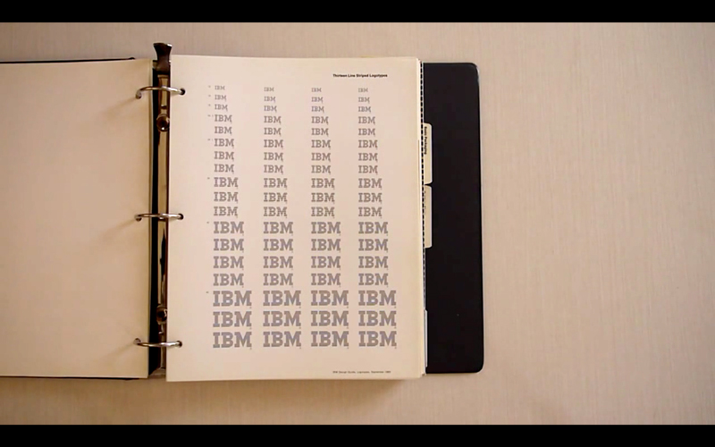
The principal visual-semiotic element that was produced by corporate identity was the logo. While still functioning as the legal inscription of property, the corporate logo was abstractly formalized into something more negative and universalizing than it had been previously. Paul Rand: “a symbol of a corporation … is not a sign of quality … it is a sign of the quality.”38 That is to say, a logo should not express some single set of contingent features of a company, but should aspire to signify nothing beyond its own abstraction, as the nearly invisible but nonetheless indelible framework for everything within it. This is the spectacular reflexive achievement of corporate modernist form, which in extreme cases practically diagrams the syntagmatic valorization of capital (money—commodity—money) while at the same time resembling a swastika.

Insofar as it produces identity through exchangeability, the modernist corporate logo functions in many ways like money, the ur-form of exchange value. Marx writes:
Value … assuming at one time the form of money, at another that of commodities, but through all these changes preserving itself and expanding, requires some independent form, by means of which its identity may at any time be established. And this form it possesses only in the shape of money.39
As John Harwood has written, the corporate logo “like another ubiquitous form of inconvertible value, money, is an object that adheres to other objects and manufactures a topological equivalence; much as money grants objects exchange value through its putative status as both a universal ‘medium of exchange’ and guarantor of absolute value, the logo grants objects identity with one another. However, the logo differs from money or other traditional media of capital insofar as it does not identify the state, but rather the individual owner of the mark, and is not (immediately) exchangeable with another logo.” The logo — the “new” medium of twentieth-century capital — produces identity for all the commodities of the corporation, while money is “universal”: it provides identity for all the commodities in the entire economic system of the nation-state, and indeed beyond. This difference in scope between money and the corporate logo is significant in terms of the historical dialectic between the state and the corporation in the capitalist West. In the late 1980s and 90s, under the aegis of “nation branding,” an array of design projects and discourses in a number of countries, with the Netherlands in the vanguard, sought to aesthetically formalize and differentiate nation-states and their institutions within a competitive market, and thus make them like corporations. This (sometimes ironic, sometimes not) “nation-branding” enterprise took place precisely at the moment when the classic Fordist production model, and corporate modernism itself, appeared in full decline.
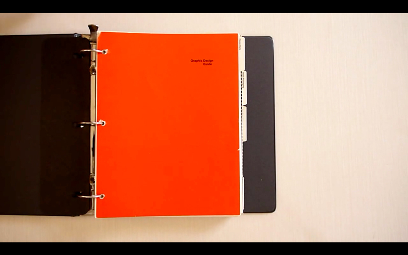
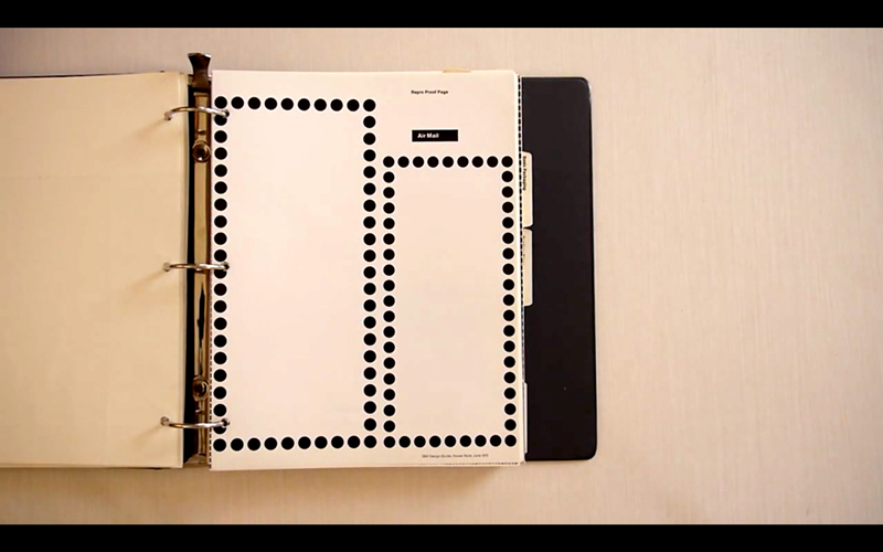
But corporate identity was more than the inscription of a logo. It was imagined as a system or program. Adorno and Horkheimer: “It does not work by concepts and images … but refers to method, the exploitation of others’ work, and capital.” How is this identity system, conceived not as a set of rigid prescriptions but as a dynamic program, propagated throughout the corporate structure? One man40 could not do it himself; he could not be everywhere at once: the system required a greater efficiency. Corporate identity instead imagined its propagation by means of the “identity manual,” a set of standardized but flexible rules which circulated through the various offices of the corporate body. In the case of IBM, its Design Guidelines was an open text comprised of printed sheets of instructions intermittently bound as a loose-leaf edition, which could acquire new pages as new contexts demanded. This administration of identity through a book of instructions might be understood as a sort of ideal instance of Taylorization in the capitalist superstructure: the symbolic system itself as an autonomous text disciplines every (symbolic) labor process within it, without the need of a supervisor, line boss or art director — or perhaps, rather, as an incipient form of Deleuze’s society of immanent biopolitical control. In any case, as the identity manual multiplied and circulated, it would organize and correct all the symbolic labor within it: the corporation as recapitulated and condensed mini-Enlightenment.
However, despite its enlightened self-image and the claims for corporate identity to spontaneously and horizontally reproduce itself through the magical agency of a text, new ranks of consultants and directors were in practice required to implement the design program. The IBM identity regime demanded the constant surveillance and regulation of Paul Rand himself, which he continued to provide as a consultant until his death. There is an uncloseable gap between the ideal of a self-regulating identity system and its execution in practice, a continuing gap that, as any graphic designer who has worked for a newly rebranded client can melancholically confirm, is only closed by the wage-coerced work of the anonymous (erstwhile white-collar) worker.
As the identity program of IBM was imagined to “horizontally” implement itself across the corporate structure, it thus did not simply govern the production of graphic design, but also and especially the white male bodies of its managerial workforce. The corporate supervision of typographic form required a regime of control of subjects. As Thomas Watson announced, the new IBM design program could not be administered from the top down, but “will happen only when good design — the awareness of it and the desire for it — begins to come through their own skins. That is why this is not an outside movement. We are trying to start one within the company, using a variety of stimuli.”41 Design at IBM was thus understood as a spirit or desire produced in corporis, from the inside out, kindled within the very bodies of its white-collared, grey-flannel-clad male managerial workforce.
The Utopia of Corporations
If these accounts of rigorous conformity, interchangeable elements, and the subordination of laboring subjects to visual identity programs are chilling to postmodern readers intent on the valorization of individual autonomy and expression, we might nonetheless see in them an almost inverted image of the collective organization and identity of socialism. Squinting our eyes, we might begin to discern what Mark Owens has called the “timely resonance”42 of these images of twentieth-century corporate identity. In the emergence of a contemporary design publishing subgenre that can only be termed corporate identity pornography,43 we might grasp a longing for, in the age of “woke” capital and ever-increasing working hours and precarity of symbolic and affective labor, the visual tangibility of an unfulfilled socialist future.
A key to elucidating this hidden utopian kernel implicit in corporate modernism can be found in Marx’s incomplete writings, in volume three of Capital, about the joint-stock company and the formal emergence of the modern corporation.44 For Marx, the modern corporation heralded an historic shift within the organization of capitalism that had distinct socialist implications. In the corporation, there appears for the first time a division in the functions of the capitalist, between the ownership of the means of production on the one hand and the control of the labor process on the other. Within this split the figure of the manager appears. The manager represents the interests of capital but does not himself own the capital, and therefore does not receive its profits but is rather paid a wage. While the manager benignly co-ordinates the labor process of the workers, like an orchestra conductor, in Marx’s metaphor, he also plays his role in coercing the working class, on behalf of the capitalist, through speed-ups and demands for increased working intensity, in order to extract the surplus value that capital requires. The manager is therefore an ambiguous character in the unfolding political terrain of class struggle in capitalism. Managers appear as wage-laborers who don’t own the means of production, but who nevertheless represent the interests of those that do. For graphic designers, who struggle to understand their own position within the labor-capital antagonism, the stakes of this ambiguity are acutely contemporary. Are we exploited wage laborers, compelled to sell our labor power to the bosses? Can we trace our historical antecedence to those unruly and radical print workers of the sixteenth century who were among the first of the working class to organize a strike?45 Does our self-interest as a class therefore lie in contesting and overturning the hegemony of the capitalist class? Should we unionize, perhaps with other kinds of exploited freelancers? Or (less hopefully) are we actually capitalists-in-training, working our way up the managerial ranks to one day become bosses ourselves, in order to get our eventual share in the fruits of capital?


For Marx, the corporate organization of production, in which the manager orchestrates the labor of the working class, but does not himself own the means of production, was highly significant. It disentangled the coordination of the labor process from the ownership of the means of production, and thereby demonstrated the formal redundancy of the capitalist to the social process of production. Private ownership of capital, in the revelation of the modern corporation, is not required to organize the labor process. Capitalism, beginning in the violence of primitive accumulation and the continuing theft of value that constitutes private ownership,46 socially organizes production at scales that pre-capitalist, artisanal modes of production could only dream of. As the structure of this organization globally develops, relations of ownership become less and less important to the organization of production. Socialism, at an international scale, might follow. The modern corporation, for Marx, thus signified the possibility of “the abolition of the capitalist mode of production within the capitalist mode of production itself.”
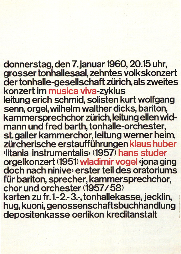
The standard design history narrative is that mid-century corporations seized the forms of early modernism and erased their socialist origins in order to streamline the appearance of those commodities exploding in the post-war capitalist expansion of markets. While this is no doubt true, and if it is indeed a stretch to imagine the mid-century corporation as a socialist formation, we might nonetheless start to grasp a sense of the formal appearance of its incipient international and utopian characteristics, particularly in the extreme case of its Swiss variation. The “‘supranational anonymous form language” known as the Swiss and International style of graphic design attempted to produce a world “cleansed,” in Richard Hollis’ evocative word, of the enchantments of capitalist modernity. Josef Müller-Brockman, a student of Emil Ruder, was a vividly representational figure. In the 1950 and 60s, based in Zurich, Müller-Brockman renounced “pictorial,” image-based graphic design as well as bourgeois notions of artistic freedom, in order to construct and theorize a transparent and non-hierarchical medium for graphic design. While his erstwhile collaborators Richard Paul Lohse and Carlo Vivarelli deviated from this rigorous vocation to pursue careers in the fine art world, Müller-Brockman followed the formal demands of what Soviet design theorists, around the same time, called “technical aesthetics” and “industrial graphics.”47 The affective aura of the image was displaced by the pure typographic signifiers of corporate communication.48 In such a world of objective form, art was unnecessary, or at least boring and absurdly self-serving.49 It is strangely both nearly impossible and not difficult at all to imagine the precise typographic forms of a world thus cleansed of the affective enchantments of the commodity: anonymous sans serif type exactly unjustified, a single level of organization in multiple fields of language: no form superfluous to its content. Which is also to say, if the form is clear, the content — a society of production emancipated from capital50 — is not. But in the severe forms of the Swiss “style,” we might retroactively see, in the otherwise obfuscated commodity form, the prosaic negation of the constitutively concealed identity of capital — the abstraction of labor and the extraction of surplus value.
(If we can grasp the incipient political figuration and communist reference in this ideology of corporate form, others could too. While Müller-Brockman explicitly disavowed political content in his own professional work,51 it’s strangely true that Marx was in the air of 1960s graphic design in Switzerland. Hans Rudolph Lutz, who also studied with Emil Ruder and established the typography department at the Schule fur Gestaltung Lucerne in the politically significant year of 1968, weirdly produced this typographic portrait of Marx in the pages of Typographische Monatsblätter: 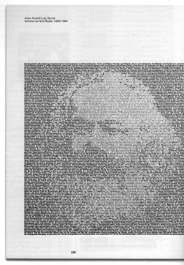
As Karl Gerstner said of the “mobile” grid of Capital — not the volume of political economy by Karl Marx but the Swiss journal of financial abstraction — “the grid looks complicated to anyone not knowing the key. For the initiate it is easy to use and (almost) inexhaustible as a programme.”52
Let’s say the program is the abolition of capitalism.

X-Ray Spex, “Identity/“Let’s Submerge” (EMI International, 1978). ↩
Is corporate FOMO the neoliberal, control society answer to state terror in the old disciplinary regime? [Alan Smart] ↩
Karl Gerstner, Designing Programmes (Zurich: Lars Müller Publishers, 2019 (1964), 9. ↩
“The weak form of the argument merely supposes a homology between these processes (economic abstraction is structured like psychic abstraction, which in its turn is structured like philosophical abstraction or unity); while its stronger form asserts a priority of the ‘economic,’ in the sense that stamping goods as uniform and producing uni-form good is a more complex functional activity than the production of uniform thoughts.” Frederic Jameson, Late Marxism: Adorno or the Persistence of the Dialectic (London: Verso, 2007 (1990), 23. ↩
ibid ↩
Benedict Anderson, Imagined Communities: Reflections on the Origin and Spread of Nationalism, Revised Edition (London: Verso, 1991). ↩
Fernand Braudel, The Structures of Everyday Life: Civilization and Capitalism 15th–18th Century, Volume 1 (New York: Harper & Row, 1981), 400. ↩
This production of books was of course not simply the expression of the unified will of capital. It was accomplished through the haphazard migration of an emerging class of itinerant print-workers. “Like gunners looking for hire, printing workers with makeshift equipment wandered at random, settled down when the opportunity offered and moved on again to accept the welcome of a new patron.” ibid ↩
E.J. Hobsbawm, Nations and Nationalism Since 1780. (Cambridge: Cambridge University Press, 1990), 53–54. ↩
Theodor W. Adorno, Notes to Literature (New York: Columbia University Press, 2019), 298. ↩
Other Forms, Books Kill Buildings, Internet, Capital, Selves (Chicago: Other Forms, 2016). ↩
Etienne Balibar and Immanuel Wallerstein, Race, Nation, Class: Ambiguous Identities (London: Verso, 1991), 7. ↩
And we should note that there is no identity that is not an imaginary identity. ↩
Despite some interesting twentieth-century attempts, like Esperanto. ↩
see Immanuel Wallerstein, The Modern World System, Volume 1 (New York: Academic Press, 1974). ↩
Frantz Fanon, The Wretched of the Earth (New York: Evergreen Black Cat, 1968), 189. ↩
Langston Hughes,”Lenin” from Collected Poems (New York: Vintage Books, 1995), 318. ↩
Emil Ruder, “The Typography of Order,” in Looking Closer 3: Classic Writings on Graphic Design (New York: Allsworth Press, 1999), 137. ↩
Emil Ruder, Typographie: Ein Gestaltungslehrbuch (Zurich: Verlag Niggli, 2001 (1967) 22. ↩
Joke about Comic Sans. ↩
Max Horkheimer and Theodor Adorno. Dialectic of Enlightenment (New York: Continuum, 1987 (1944), 7. ↩
Emil Ruder, “The Typography of Order,” 137. ↩
Paul Rand, Thoughts on Design (New York: Wittenborn, 1947), 90. quoted in John Harwood, The Interface: IBM and the Transformation of Corporate Design, 1945–1976 (Minneapolis: University of Minnesota Press, 2011), 53. ↩
Jan Tschichold, quoted in Rick Poyner, Typographica (Princeton Architectural Press, 2001), 45. ↩
The first issue of Capital, designed by Karl Gernstner, used the same typeface as the first edition of Karl Marx’s book. For more documentation of Gerstner’s design work in Capital, see Flat File 3, March 3, 2016, published by the Herb Lubalin Study Center of Design & Typography. ↩
Karl Marx, Das Kapital: Kritik der politischen Oekonomie, 1867 ↩
Karl Marx, Capital: A Critique of Political Economy, Volume 1 (New York: Penguin, 1976), 138. ↩
Sianne Ngai, Our Aesthetic Categories: Zany, Cute, Interesting (Harvard University Press, 2012), 61. ↩
Frederic Jameson, Late Marxism, 24. ↩
i.e. this essay that you’re reading now. ↩
Horkheimer and Adorno, Dialectic of Enlightenment, 7. ↩
Karl Gerstner, Designing Programmes, 13. ↩
an anecdote related in John Harwood, The Interface, 39. ↩
one among many: Michael Hardt and Antonio Negri, Empire (Cambridge: Harvard University Press, 2000), 280–304. ↩
in part two of this essay, appearing, we predict, in the next issue of Counter-Signals. ↩
Paul B. Preciado, Testo Junkie (New York: Feminist Press, 2013), 23–55. ↩
Paul Rand, A Designer’s Art (New Haven: Yale University Press, 1985), 24. ↩
Karl Marx, Capital: A Critique of Political Economy, Volume 1, 252. ↩
Indication of gender here, and passim in pronouns, is left masculine to record the resolute patriarchal content of mid-century corporate personnel. ↩
quoted in Harwood, The Interface, 48. ↩
Mark Owens, “The Facit Model,” in The Facit Model: Globalism, Localism, and Identity (Leipzig: Spector Books, Leipzig: 2019), 62. ↩
“I use the term pornographic because these management techniques function no longer through the repression and prohibition of sexuality, but through the incitement of consumption and the constant production of a regulated and quantifiable pleasure. The more we consume and the better our health, the better we are controlled.” Paul Preciado, in “Learning from the Virus,” Artforum, May/June 2020. ↩
See “Karl Marx and the Corporation,” J.W. Mason, in Jacobin (July 5, 2020). The exposition that follows is entirely indebted to this brief but detailed account. ↩
For a vivid account of both the early conditions of labor for print workers and their resistance to capitalist discipline see Lucien Febvre and Henri-Jean Martin, The Coming of the Book (London: Verso, 1976 (1958), 129–136. ↩
Violence that now continues within the market under the regime of “peace” enforced by the state through the law. [Alan Smart] ↩
Rokas Sutkaitis, Soviet Logos: Lost Marks of the Utopia (Klaipéda, 2020), 12. ↩
Müller-Brockman “radically renounced all representation and reduced his design resources to typography alone.” Josef Müller-Brockman: Pioneer of Swiss Graphic Design (Zurich: Lars Müller Publishers, 1995), 34. ↩
Richard Hollis, describing the rigorous intertwining of the material printing process with the typographic and formal order of Jan Tschichold’s Der Berufsphotograph poster, says “a pioneering work or whatever you take it to be —— it makes a lot of art look just self-indulgent.” Richard Hollis, Writings about Graphic Design (London: Occasional Papers, 2012), 60. ↩
“The life-process of society, which is based on the process of material production, does not strip off its mystical veil until it is treated as production by freely associated men, and is consciously regulated by them in accordance with a settled plan. This, however, demands for society a certain material ground-work or set of conditions of existence which in their turn are the spontaneous product of a long and painful process of development.” Karl Marx, Capital, volume 1, 173. Quoted by Carl Andre in Art-Rite 14, 1976, cover. ↩
“Political propaganda was excluded as stringently as the advertising of potentially harmful commodities.” Josef Müller-Brockman: Pioneer of Swiss Graphic Design, 35. ↩
Karl Gerstner, Designing Programmes, 33. ↩